hai
AlertManager Slack Notifications That Don’t Suck
The Problem
I run kube-prometheus-stack with AlertManager sending alerts to a Slack channel. The in-app Slack experience is great: color-coded sidebars, severity badges, summary text, action buttons for runbooks, queries, and silencing.
But I don’t always have Slack open. When an alert fires and I get a push notification on my Apple Watch or macOS, this is what I used to see:
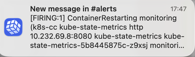
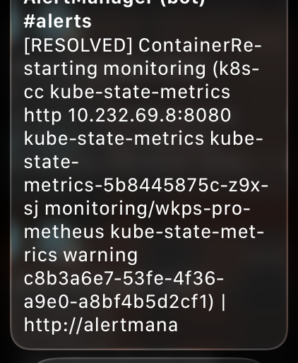
A wall of raw Prometheus labels, internal IPs, pod names, and truncated URLs:
[RESOLVED] ContainerRestarting monitoring (k8s-cc kube-state-metrics http
10.232.69.8:8080 kube-state-metrics kube-state-metrics-5b8445875c-z9xsj
monitori... kube-prometheus-stack-kube-prom-k8s-resources-workloads-namespace
https://alertmana...
No severity, no summary, no namespace context. On an Apple Watch screen, that’s completely useless for triage. I can’t tell if something critical is on fire or if it’s just an info-level alert I can ignore.
Why Push Notifications Look Bad
Slack discontinued its dedicated Apple Watch app back in 2018. What Apple Watch shows now are mirrored iOS push notifications. The same applies to macOS notification banners.
The key insight: Slack push notifications only render the fallback field from message attachments. Everything else (title, text, color sidebar, action buttons) is in-app only.
Here’s what renders where:
| Feature | Slack App | Push Notification (Watch/macOS) |
|---|---|---|
fallback text |
Hidden | This is all you get |
title |
Yes | No |
text (with markdown) |
Yes | No |
color sidebar |
Yes | No |
| Action buttons | Yes | No |
| Bold, code blocks | Yes | No (stripped to plain text) |
| Unicode emoji | Yes | Yes |
AlertManager does set a default fallback template, but it’s just the alert title and the AlertManager URL. Not much better. And if you override the title template (like I did), the fallback still combines it with all the alert labels, resulting in the unreadable dump I was seeing.
The Fix
The solution is simple: add a custom fallback template that’s optimized for tiny screens, while keeping the rich in-app formatting untouched.
The Fallback Template
I added a slack.fallback template to my AlertManager ConfigMap that front-loads the important bits: status, severity (as emoji), alert name, namespace, and summary. All in plain text, targeting under 150 characters (Apple Watch Long Look shows about 4-6 lines before scrolling).
🔴 🟡 🔵 ✅ : in -
Important details:
- Unicode emoji instead of Slack colon syntax (
:fire:) because the fallback renders outside the Slack app where colon syntax doesn’t work - Severity as colored circles: 🔴 critical, 🟡 warning, 🔵 info, ✅ resolved. Scannable at a glance on a tiny screen
- Namespace included so I immediately know which service is affected
- Summary appended for context, but it gets truncated naturally if too long
Wiring It Up
In the AlertManager slack_configs, I added the fallback field alongside the existing title and text:
slack_configs:
  - api_url_file: /etc/alertmanager/secrets/alertmanager-secrets/slack_api_url
    channel: "#alerts"
    # fallback is the only field shown in push notifications (iOS/Apple Watch).
    # title/text/color/actions only render inside the Slack app.
    fallback: ''
    color: ''
    title: ''
    text: ''
The Result
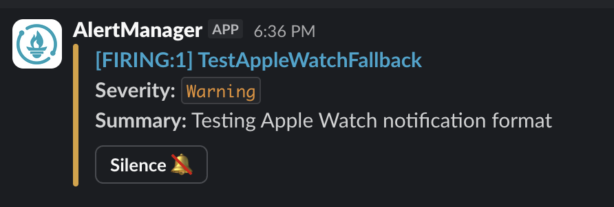
After deploying, I fired a test alert and checked all three surfaces:
Apple Watch
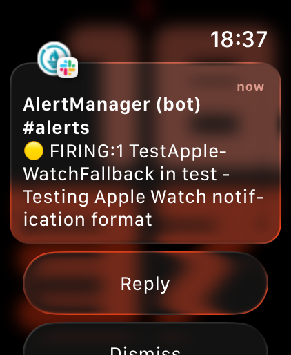
Compact, readable, severity is immediately visible from the yellow circle emoji. I can tell at a glance: it’s a warning, it’s firing, what alert, which namespace, and a brief summary.
macOS Notification Banner
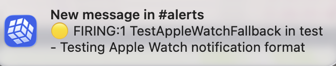
Same fallback text, clean and scannable in the notification banner.
Slack In-App (Unchanged)
The in-app experience stays exactly the same: color sidebar, severity badge, summary, action buttons. The fallback field is completely independent from the attachment rendering.
Key Takeaway
AlertManager’s Slack integration has two completely independent rendering paths. The in-app experience (title, text, color, buttons) and the push notification experience (fallback) are separate fields. If you’re only customizing title/text/color, your push notifications are getting the auto-generated default, which is basically useless.
Set the fallback field explicitly and optimize it for the smallest screen you’ll read it on.